
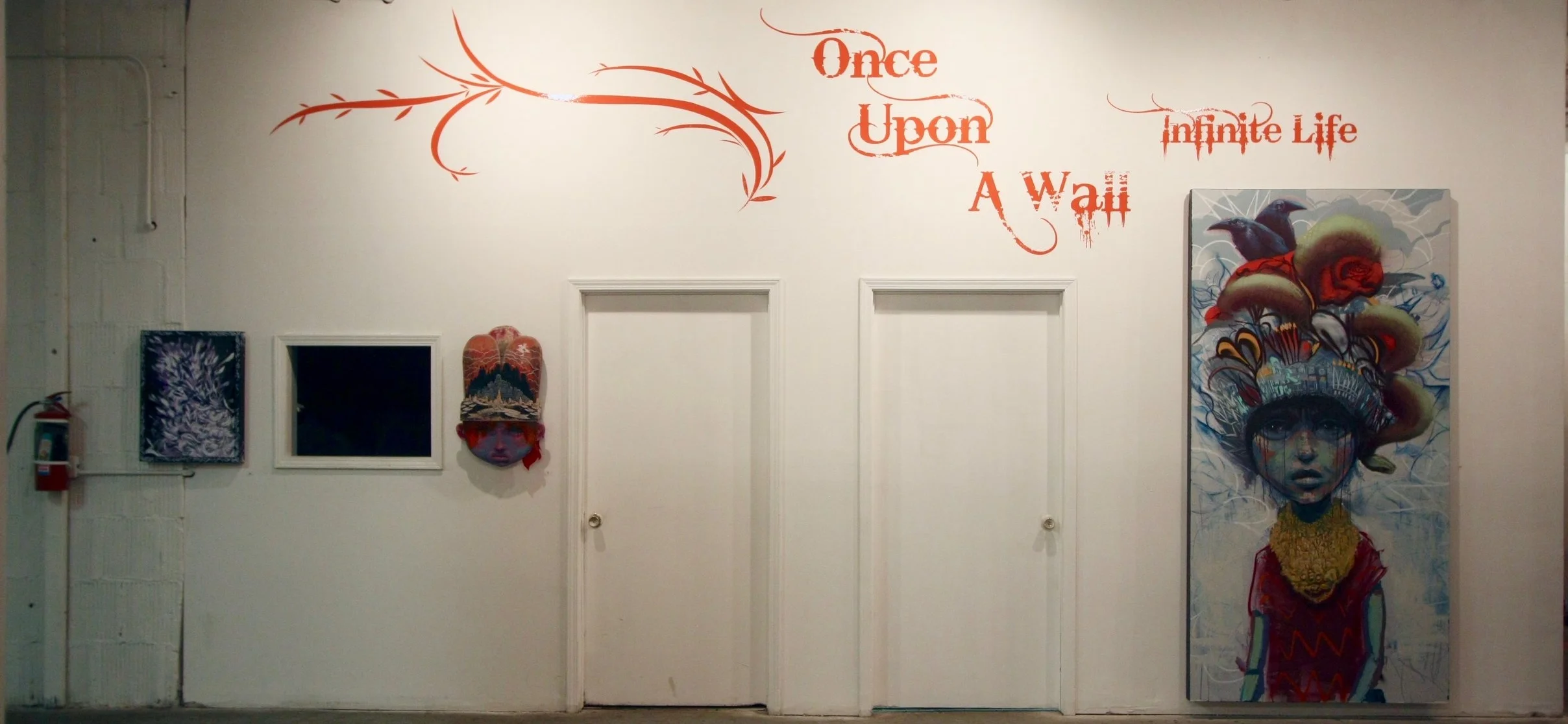
ONCE UPON A WALL: THE DETAILS SERIES
Curator's note:
Early in 2016, I had the great fortune of curating a ground-breaking narrative mural exhibition titled "Once UpOn A Wall: Infinite Life" with the talented local artist, Bunny XLV. The exhibition features work by twenty-two of the top street artists in Chicago across eleven collaborative pieces. In the same way a story is told in chapters, the murals sequentially tell their stories through images, those being from life to death.
With the entirety of the exhibition having been created on-site, I became intimately familiar with the pieces and every nuance found within them. I have spent endless hours staring at these works from inception to well after the show's completion. Following de-installation, an effort was made to present the show in a variety of venues, but given the immense scale of the murals, it proved to be an exceedingly difficult task.
During this time, I formed Sinergia Art with the ever amazing, Lindsey Meyers, founder of Beauty & Brawn Art Gallery and Think Space. As I continued to contemplate the show's re-envisioning, the constant takeaway was the amount of collaboration and utter talent expressed within these works. After much discussion, Lindsey and I decided to create a new version of "Once UpOn A Wall" at Beauty & Brawn that highlighted those nuances and details I was so drawn to.
"Once Upon A Wall: The Details Series" allowed us to extrapolate the most important technical and artistic aspects of each "story", and yet maintain the integrity of each original chapter in a condensed two or three panel display. The shift in approach and the alternative perspective together create a sense of intrigue and curiosity, and the new schema easily envelops the viewer and connects them with the work in new and powerful ways. Our hope is that the public embraces the same features and characteristics that so strongly captured our attention.
Below you will find explanations of each piece/story and why they were chosen. With no two murals alike, stylistically, there is undoubtedly something for everyone.
Sincerely,
Simone Garcia & Lindsey Meyers
CREATION
NERD, BOAR 1, SERK
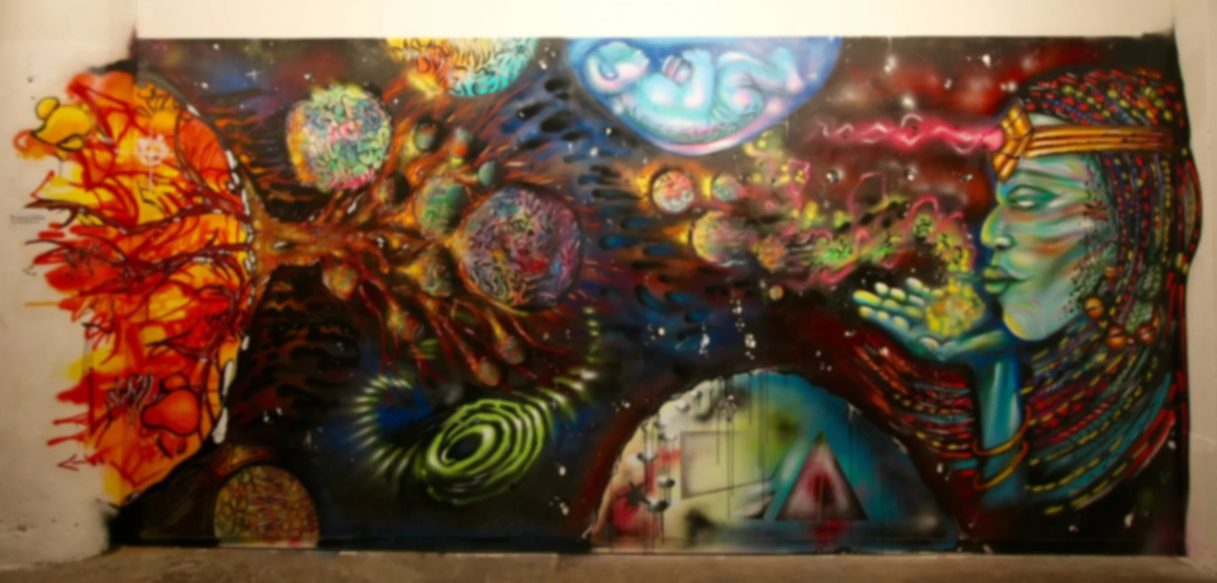
With over 40 years combined these three artists have represented Chicago's art scene in a significant way . Nerd, Boar and Serk possess attributes uniquely their own however, given their intimate knowledge of one another they are able to collaborate on a deeply collaborative level. These artists were tasked with opening Once UpOn A Walls story line through their interpretation of the “Creation” chapter. In this they envisioned the rebirth of Wild Style, or the abstract hand styles of early graffiti writers and artists. The trio embodied this expression as an infinite character giving life to styles as they travel across the “Styleverse” maturing into unique forms in the same way that artists develop their individual styles after studying those that came before them. In this set we selected the panels that best expressed their intent. From the inception of life of the planets to their symbiotic joining with the other planets of style. The intention was to show the roots and beginnings of graffiti art and their current effort to revitalize the style.
INDULGENCE
CYFN, LABRAT 143
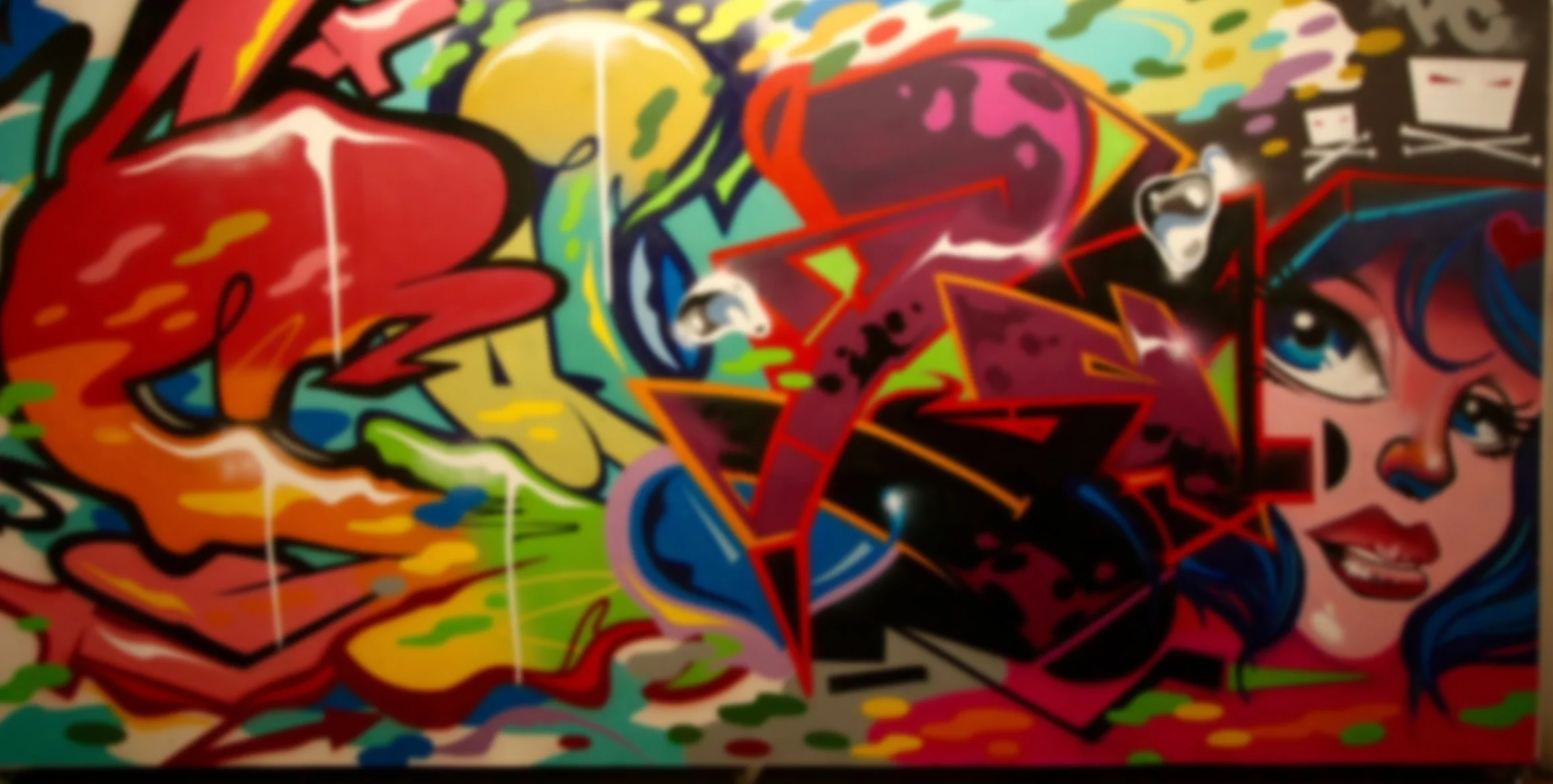
Cyfn, with his expertise in color splash’s and blends combined with Labrat’s incredible sense of old school hand styles and anime character resulted in a gorgeous layering affect that makes the colors pop. These two artists, because of their innate talent with colors created what I feel is one of the most color filled pieces of the set.
ANARCHY
ANTCK, CHEMA SKANDAL!
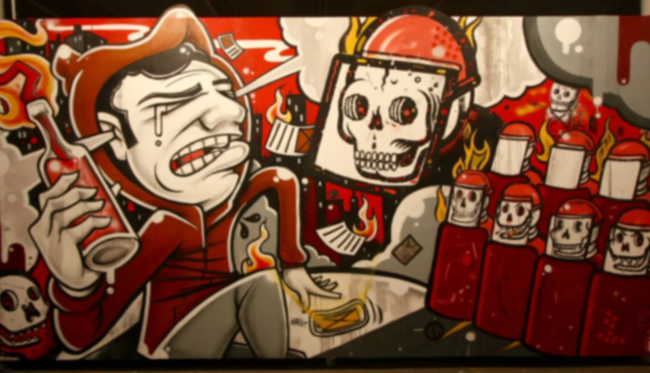
Sometimes people are meant to meet and create together. With their clean lines and careful approach to detail Antck and Chema Skandal! were able to seamlessly blend their styles. Antck’s approach is disciplined and full of tricks and techniques that help to create layers of illustrative depth. Within the Molotov cocktail his character is holding you can see scoring along the details within it. This is the result of the technique used to create the fine, sharp paint lines. The cut lines add a great texture that you almost want to reach out and touch. Balanced with Chema Skandals! meticulously crafted skeleton riot police a powerful piece about rebellion and oppression is created. With the addition of wheat paste and smudging affects, the details are what really make this piece great. The Pac Man in the eyes of the skeletons to the building lights on the side of the buildings it’s the subtle but important things that accomplish what it does. It was interesting seeing how these two shared techniques that they were able to take away and apply to their individual practices. The two artists share the entire wall and interweave their work making this a truly collaborative effort. Now more than ever does this piece feel relevant and symbolic.
TEMPERANCE
BUNNY XLV, CERA
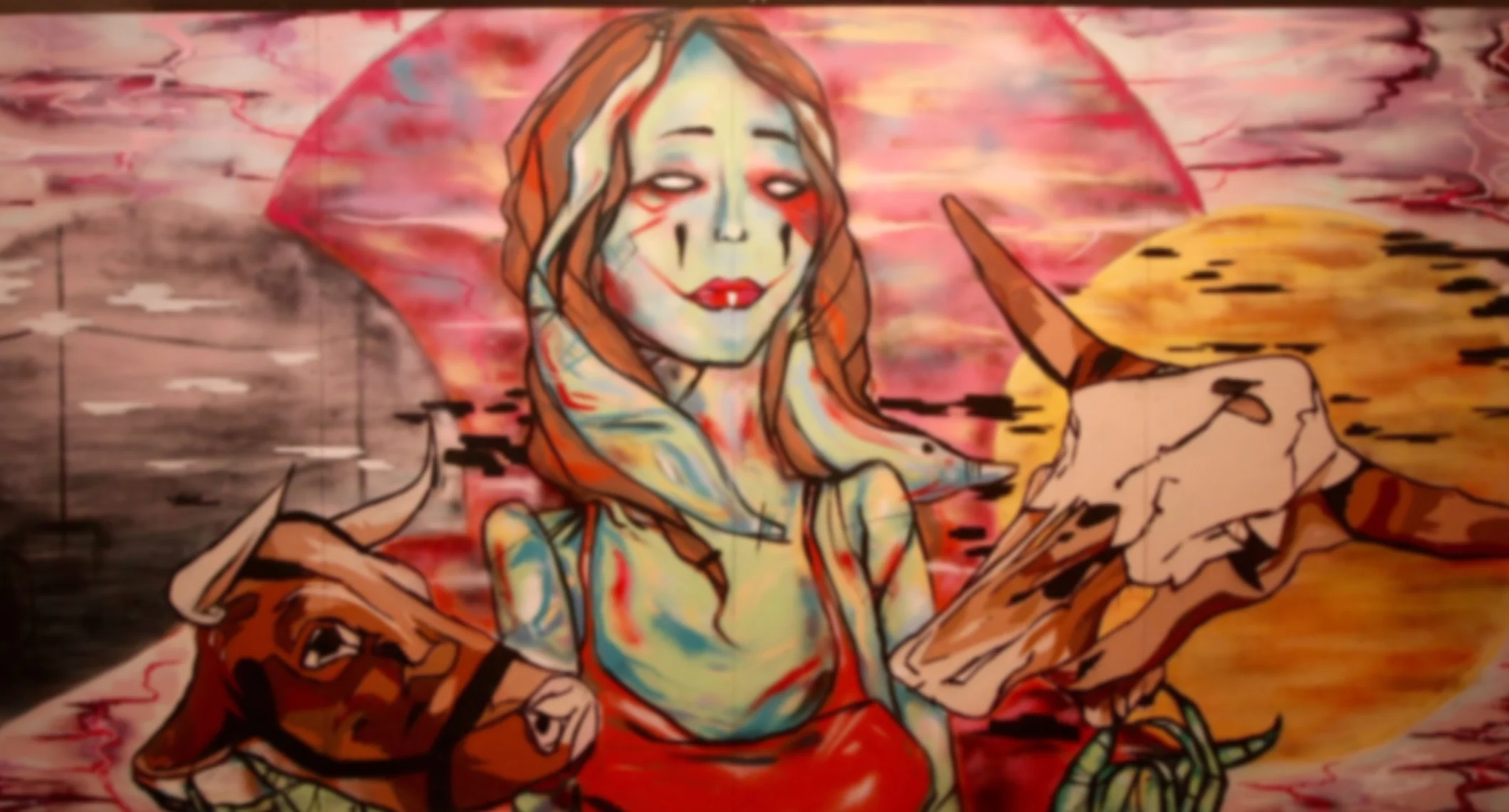
With two distinctively different styles, the chapter “Temperance” as interpreted by Bunny Xlv and Cera resulted in a unique mural that was another first collaborative effort. The free form style of Bunny Xlv lends itself to great character work and color blends which in this case are overlaid by the detailed cow heads and moons. Cera worked primarily in acrylic spray paint, with Bunny adding layers of detail with detailed brushwork. The characters lips and eyes are one of the defining characteristics of Bunny’s work and they come across exemplary here. This mural continues to reveal it's beauty over time and is a pleasure to view in its entirety.
DEATH
BRAIN KILLER, YOKI

With “Death” as the closing chapter of “Infinite Life” and Brain Killer and Yoki being leaders of the monster and horror genre, they were naturally tasked with interpretation of the theme. There are a couple of technical aspects to this section of the mural that show great skill of these two. With 6 light sources highlighting the faces of the characters, they gave a lot of depth to the zombie apocalypse we are presented with. Secondly is the amazing mushroom cloud that anchors the entire mural. Purple and pink highlights beneath the clouds shading over the yellow hue of the cloud. One of the impressive details of the show is the mushroom. The gradual shading and great symmetry contributed to the amazing effect resulting in what most of the participating artists have found to be the coolest feature of the show.
FAILURE
MOSHER, JC RIVERA
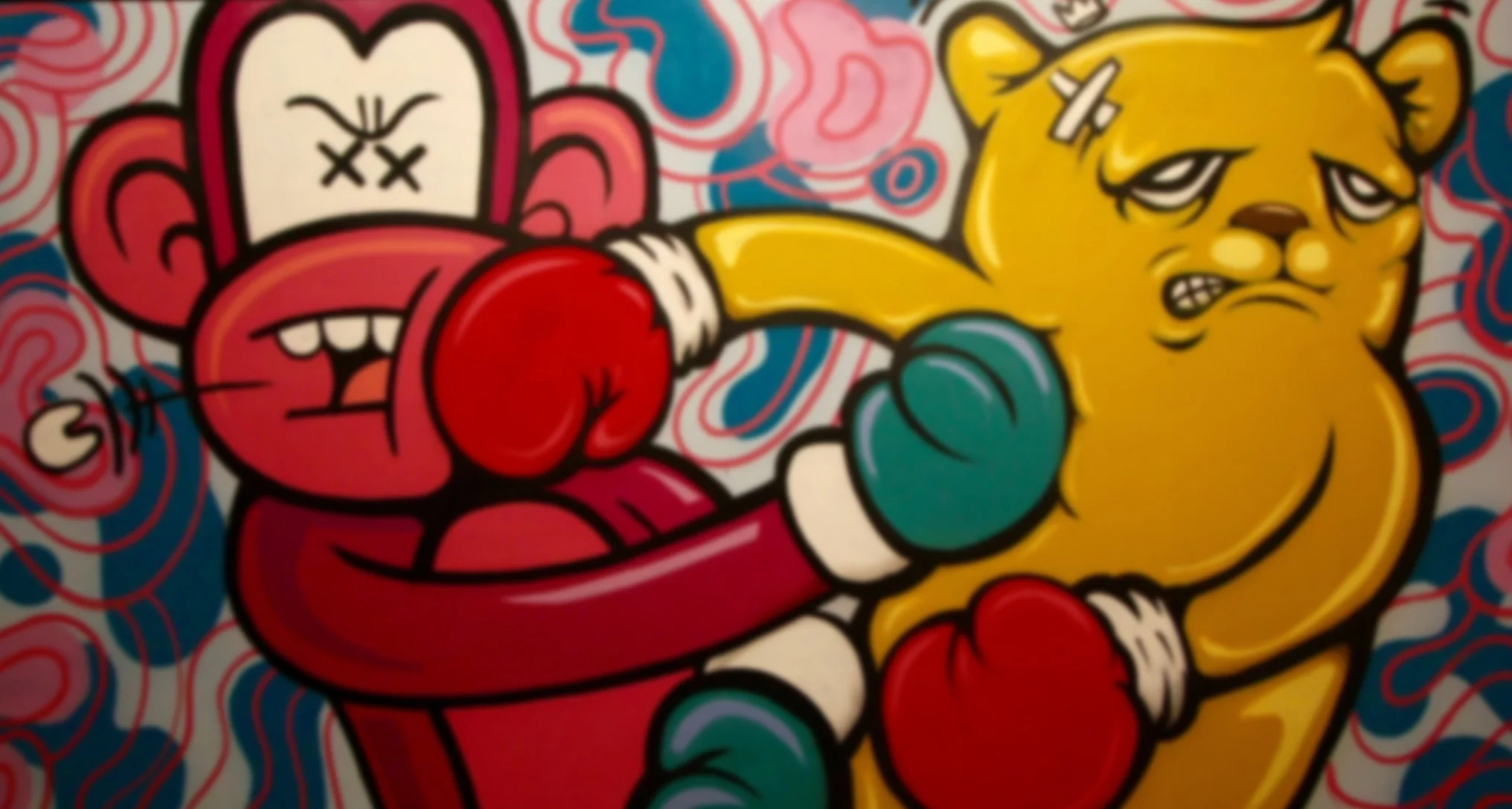
JC Rivera and Mosher are two of Chicago’s most recognizable character artists. For Failure they came together to create a pop cultural piece where the two characters express failure by simultaneously knocking each other out. This is the first time these two artists painted together to make a collaborative piece of this type. Clean, animated lines made it a natural fit and show their skill at the effortlessness of it. This piece was selected to show Mosher’s character style, if you notice the glove of JC’s bear in the right frame you can see how their styles work together.
INVINCIBILITY
RAHMAAN STATIK, DREAD SKE
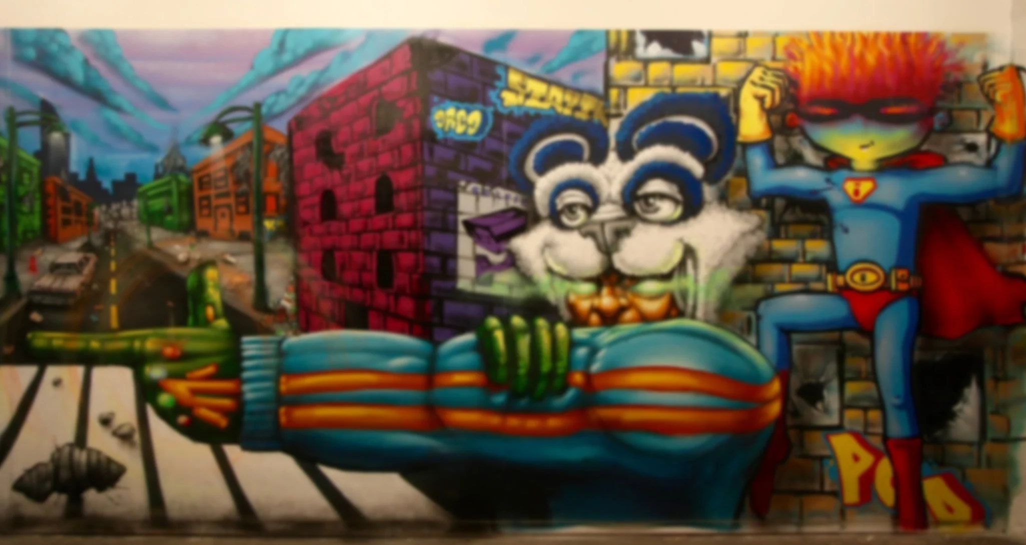
Childhood brings with it a sense that nothing can harm us as we rush at the world full tilt. In some cases this results in us fighting against the environments we’re born into. With this chapter artists Statik and Dred created a world in which a child super hero following his hero to battle against the demons that haunt his daily life. The panel for this piece was selected because of the incredible amount of detail it contains. Down to the last detail of the trash on the street it really sets the tone for the vengeful street scene laid out. A detail even more impressive is the faint color fans that appear to be emanating from the glove. These are supposed to represent the energy coming from the glove worn by the hero leading the charge for the dynamic duo. This was achieved through a great sense of spray control by Statik, in order to lightly apply the paint to achieve the result that he did. During this painting session many of the artists stood around and looked on impressed at the technique that Statik wa able to achieve. This is along with Yoki’s mushroom on the “Death” mural are two of the standout technical features.
EPILOGUE
RINE BOYER
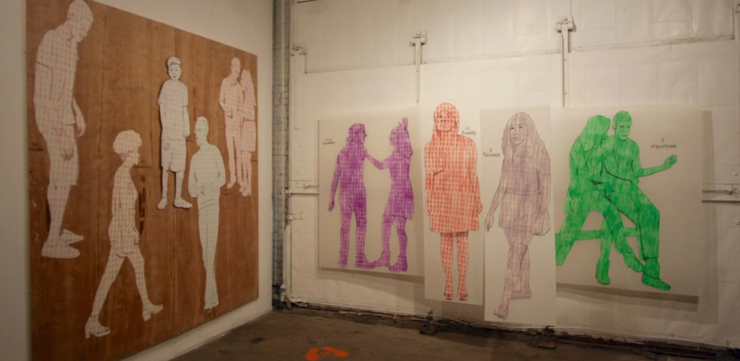
Rine Boyer is a Chicago artist based out of the Zhou B Center in Bridgeport. Her amazing figurative work has earned her much acclaim. In this piece she was selected as the only artist to work individually. She was tasked with creating a stage on which each of the chapters could be represented by characters she created. Rine imbued the characters she created with their associated stages of life through several creative means. First she designed the characters to represent their intended purpose for instance the slouched shoulders of "Failure" or the closeness of "Creation" (as shown on this presentation). Secondly she screen printed them with tarot card images that represented each of the life stages we presented. Finally the pieces were set in a way that allowed the viewer to step into place and take on the final chapter of the story... "Death." This installation was highly creative and a testament to the wonderful work Rine creates.
WISDOM
CZR PRZ, TUBZ ILLA
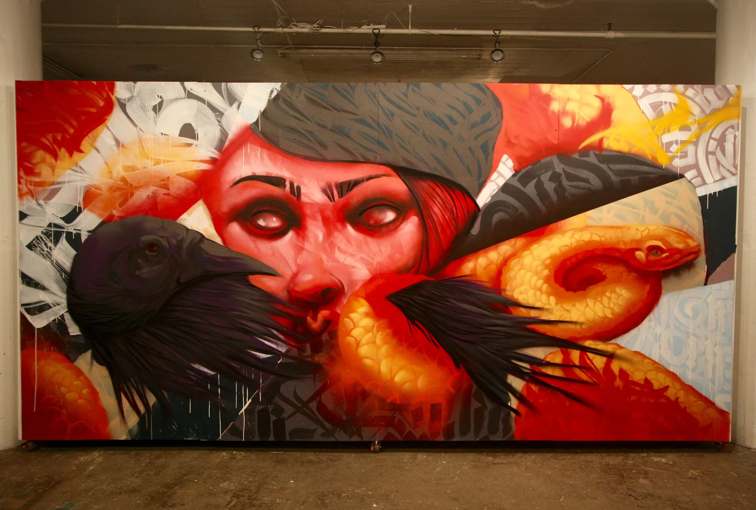
The result of this piece was really incredible. The alternating layers of Tubz’s hand and line styles and the figurative work of Czr Prz created a mural that is filled with detail and symbolism. In the full piece the human face is seated between a bird and snake. The crow and snake are often looked at as wise creatures connection to nature yet naturally dichotomous. With the human in the middle it’s meant to represent the higher order thinking of man but it’s interference in the natural world. The hand style layers represent the written word and the passing of knowledge allowing us to study and gain wisdom from the past. Tubz added additional layers on the hair and other sections to create added textural depth. This was the first time that these two artists had worked together and the way they wove their talents was very unique. Giving a large amount of time and energy to the thoughtfulness of their chapter resulted in one of the more deeply meaningful works.
REALIZATION
MAX SANSING, REVISE CMW
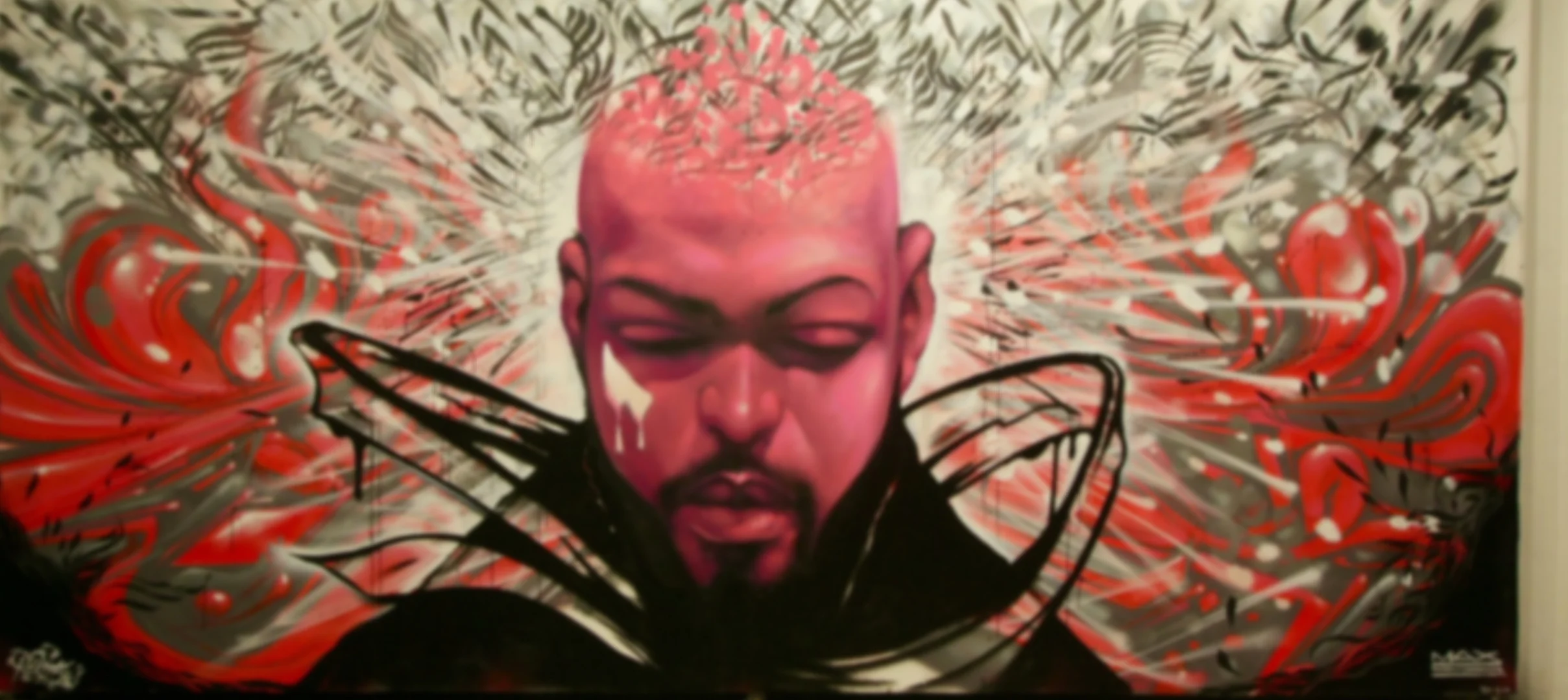
Revise’s abstract line and hand styles serve as the perfect background layer to Max Sansings well-structured characters. Background detail consisted of acrylic spray and brush work several layers deep. Once the background was laid down Max was able to effortlessly create the bust of the ethereal traveler. There was the conscious effort between the two to make sure that their work blended together seamlessly, particularly with the collar of the cloak resulting in the epitome of this type of imagery. The highlights on the cheekbones and nose are indicative of his shading, with that color often used to accomplish this in his pieces.